May 14, 2025
The Problem with Making Everything Easy
A designer’s reflection on how simplicity can sometimes strip away agency
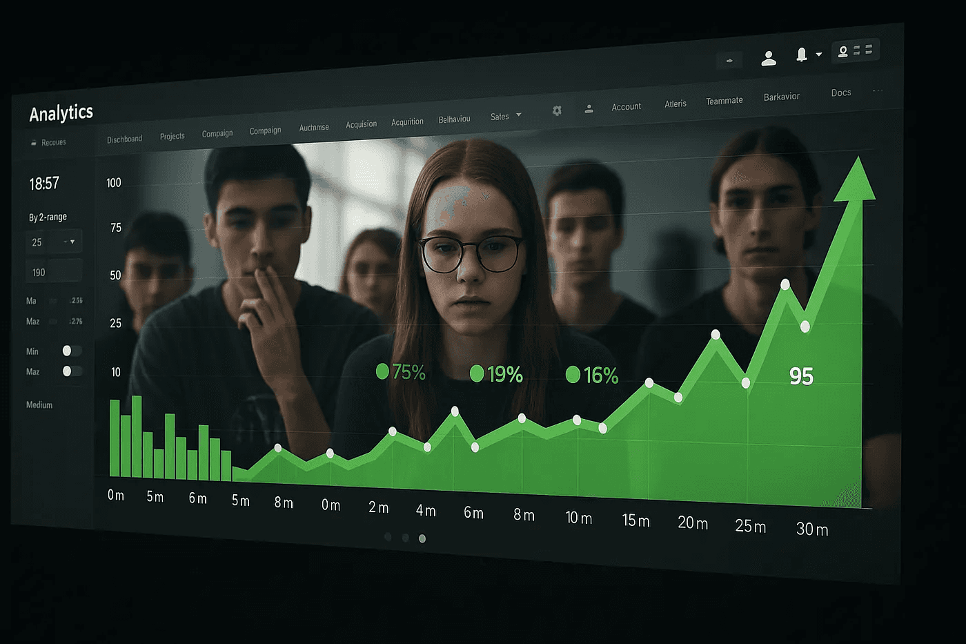
I remember the moment with perfect clarity. Our team was gathered around a table reviewing analytics from our latest feature launch, a streamlined process for setting up social media ads. The numbers were impressive: a 40% increase in completion rates, a 25% reduction in drop-offs, and glowing feedback from initial user testing.
My product manager was ecstatic. “We’ve absolutely nailed it,” she said, pulling up our before-and-after screenshots. “Look how clean this is now.”
As my colleagues celebrated, I felt an unexpected knot forming in my stomach. Yes, we had succeeded in making something easier, but at what cost? We had removed explanation screens, condensed disclosures into toggleable “learn more” links that analytics showed almost no one clicked, and reduced a multi-step confirmation process to a single tap. The streamlined version was undeniably “better” by every conventional UX metric.
Yet I couldn’t shake a nagging thought: Had we made it too easy for users to do something they didn’t fully understand?
When Frictionless Becomes Reckless
The gospel of frictionless design has dominated our industry for years. We measure success in reduced clicks, shortened paths, and minimized cognitive load. We celebrate when we remove steps, simplify choices, and accelerate processes. In many cases, this serves users well as nobody wants needlessly complex interactions.
But there’s a darker side to this pursuit of ease that we rarely discuss in our design circles. When we optimize for convenience above all else, we risk creating experiences that:
Bypass informed consent by making it easier to agree than to understand
Obscure consequences by separating actions from their effects
Remove meaningful pause points where reflection might occur
Prioritize conversion over comprehension
Consider the common pattern of progressive disclosure hiding “advanced” options behind additional taps or clicks. While this approach declutters interfaces, it also reflects a value judgment: what’s deemed “advanced” (and thus hidden) versus what’s considered “normal” (and thus visible). Too often, the controls that protect privacy, limit data sharing, or prevent financial commitment are the very ones tucked away as “advanced.”
As a designer who has implemented these patterns countless times, I’ve become increasingly uncomfortable with how easily we classify user agency as “friction” to be eliminated.
The Cultural Blindspot in Frictionless Design
Our industry’s obsession with reducing friction carries an inherent privilege that we rarely acknowledge. Many of our “best practices” assume users who:
Have prior digital literacy
Can afford mistakes
Trust institutions and systems
Have consistent access to technology
Can easily seek recourse when things go wrong
When I worked on a project targeting users in regions with low banking penetration, I watched as our Western-designed “simplified” financial app created genuine confusion. What seemed intuitive to our San Francisco testing group was bewildering to first-time banking customers in rural communities.
In low-trust environments, whether due to historical exploitation, systemic inequality, or previous negative experiences, frictionless design doesn’t always build confidence. Sometimes it does the opposite, raising suspicions about what’s being hidden or accelerated.
The speed with which we enable critical actions can be particularly problematic when working across different cultural contexts. In some communities, deliberation is valued over immediacy. A design that rushes users toward completion may inadvertently signal disrespect for their decision-making process.
When Metrics Lie (Or At Least Mislead)
Yet completion isn’t the same as comprehension. Engagement isn’t the same as empowerment.
I recall challenging a successful A/B test that showed significantly higher conversion when we removed a confirmation step from a subscription process. While the data clearly showed the “winner,” I couldn’t help but wonder about the quality of those conversions. How many users would later discover charges they hadn’t fully intended to authorize? How would that affect long-term trust?
When I raised these concerns, a colleague responded with what has become a troubling refrain in our industry: “But we’re not forcing anyone to do anything. They can always cancel.”
This perspective ignores fundamental realities of human behavior that we, as designers, exploit daily:
Status quo bias makes people unlikely to change settings once established
Cancellation friction is almost always higher than sign-up friction
Cognitive load is higher when attempting to undo an action than when performing it initially
The truth is that we design experiences with the psychological upper hand. We understand the cognitive biases that influence user behavior better than users themselves do. This knowledge comes with an ethical responsibility that metrics alone cannot address.
The Case for Constructive Friction
What if some friction isn’t just inevitable, but beneficial? What if certain forms of resistance actually improve the user experience in ways that aren’t immediately measurable?
Consider these possibilities:
Friction as education: Moments of pause can create opportunities for genuine understanding, not just acquiescence. When users engage with content rather than simply bypass it, their mental models improve.
Friction as agency: Meaningful choices require meaningful consideration. By creating intentional moments for reflection, we acknowledge users’ capacity for thoughtful decision-making.
Friction as protection: Strategic barriers can prevent impulsive actions with significant consequences, whether financial, privacy-related, or social.
Friction as ritual: Important transitions sometimes deserve ceremonial weight. Frictionless design can trivialize significant moments by making them too casual.
I’ve begun experimenting with what I call “constructive friction,” deliberately designed moments that slow users down for their benefit. This doesn’t mean returning to cumbersome processes, but rather identifying where meaningful engagement matters more than speed.
For example, instead of hiding critical information behind dismissable modals, I’ve tested interfaces that require demonstration of understanding before proceeding. Rather than enabling one-click commitments to recurring financial obligations, I’ve designed staged processes that reflect the gravity of the commitment.
The results have been surprising. While completion rates sometimes decrease, customer service inquiries about the same features drop significantly. Users report higher confidence in their decisions and, perhaps most importantly, higher trust in the product.
The Designer’s Dilemma
But I’ve developed a set of questions that help me navigate this territory more thoughtfully:
Who benefits most from this simplification? The user, or the business?
What understanding am I assuming? Am I designing for the average user, or for all possible users?
What might users regret later? Have I created adequate safeguards against foreseeable regret?
Where does reflection matter? Are there decisions that deserve more time and attention?
How would I explain this design choice to someone who was harmed by it? Could I defend it as truly user-centered?
Sometimes, these questions lead me to fight for designs that don’t perform as well in initial testing but that I believe better serve users’ holistic needs. Other times, they simply make me more conscious of the trade-offs I’m accepting.
Finding Balance in an Industry Obsessed with Ease
I’m not advocating for a return to needlessly complex interfaces or excessive confirmation steps. The advances we’ve made in usability are valuable and have democratized access to technology in meaningful ways.
What I’m suggesting is more nuanced: that we expand our definition of “good design” to include not just ease, but understanding; not just speed, but agency; not just engagement, but empowerment.
As designers, we hold immense power to shape behavior, influence decisions, and establish norms. With that power comes the responsibility to question industry dogma, even when that dogma has served our careers well.
The most ethical designs aren’t always the easiest to use. Sometimes, the friction we’re so quick to remove is exactly what users need to make decisions they won’t regret.
Where Do We Go From Here?
I don’t believe we need to choose between user-friendly design and ethical design. The best work accomplishes both. But achieving that balance requires us to question assumptions that have become almost religious in our field:

That all friction is inherently bad
That faster is always better
That simpler always means more accessible
That higher conversion rates indicate more successful design
As our digital products become increasingly embedded in critical aspects of users’ lives (finance, health, social connection, education), the stakes of our design decisions grow higher. The patterns we implement don’t just affect conversion metrics; they shape how people understand, interact with, and trust technology.
I’m challenging myself, and other designers, to approach friction differently, not as an enemy to be eliminated, but as a design material to be thoughtfully applied. Sometimes the most caring thing we can do for users is to slow them down, to create space for understanding in a digital landscape that increasingly demands their attention but rarely their comprehension.
What’s the role of friction in responsible design? And are we too quick to remove it in the name of “user delight”?
These questions don’t have universal answers, but they deserve our continued reflection as we shape the digital world that shapes us in return.
A designer’s reflection on how simplicity can sometimes strip away agency
I remember the moment with perfect clarity. Our team was gathered around a table reviewing analytics from our latest feature launch, a streamlined process for setting up social media ads. The numbers were impressive: a 40% increase in completion rates, a 25% reduction in drop-offs, and glowing feedback from initial user testing.
My product manager was ecstatic. “We’ve absolutely nailed it,” she said, pulling up our before-and-after screenshots. “Look how clean this is now.”
As my colleagues celebrated, I felt an unexpected knot forming in my stomach. Yes, we had succeeded in making something easier, but at what cost? We had removed explanation screens, condensed disclosures into toggleable “learn more” links that analytics showed almost no one clicked, and reduced a multi-step confirmation process to a single tap. The streamlined version was undeniably “better” by every conventional UX metric.
Yet I couldn’t shake a nagging thought: Had we made it too easy for users to do something they didn’t fully understand?
When Frictionless Becomes Reckless
The gospel of frictionless design has dominated our industry for years. We measure success in reduced clicks, shortened paths, and minimized cognitive load. We celebrate when we remove steps, simplify choices, and accelerate processes. In many cases, this serves users well as nobody wants needlessly complex interactions.
But there’s a darker side to this pursuit of ease that we rarely discuss in our design circles. When we optimize for convenience above all else, we risk creating experiences that:
Bypass informed consent by making it easier to agree than to understand
Obscure consequences by separating actions from their effects
Remove meaningful pause points where reflection might occur
Prioritize conversion over comprehension
Consider the common pattern of progressive disclosure hiding “advanced” options behind additional taps or clicks. While this approach declutters interfaces, it also reflects a value judgment: what’s deemed “advanced” (and thus hidden) versus what’s considered “normal” (and thus visible). Too often, the controls that protect privacy, limit data sharing, or prevent financial commitment are the very ones tucked away as “advanced.”
As a designer who has implemented these patterns countless times, I’ve become increasingly uncomfortable with how easily we classify user agency as “friction” to be eliminated.
The Cultural Blindspot in Frictionless Design
Our industry’s obsession with reducing friction carries an inherent privilege that we rarely acknowledge. Many of our “best practices” assume users who:
Have prior digital literacy
Can afford mistakes
Trust institutions and systems
Have consistent access to technology
Can easily seek recourse when things go wrong
When I worked on a project targeting users in regions with low banking penetration, I watched as our Western-designed “simplified” financial app created genuine confusion. What seemed intuitive to our San Francisco testing group was bewildering to first-time banking customers in rural communities.
In low-trust environments, whether due to historical exploitation, systemic inequality, or previous negative experiences, frictionless design doesn’t always build confidence. Sometimes it does the opposite, raising suspicions about what’s being hidden or accelerated.
The speed with which we enable critical actions can be particularly problematic when working across different cultural contexts. In some communities, deliberation is valued over immediacy. A design that rushes users toward completion may inadvertently signal disrespect for their decision-making process.
When Metrics Lie (Or At Least Mislead)
Yet completion isn’t the same as comprehension. Engagement isn’t the same as empowerment.
I recall challenging a successful A/B test that showed significantly higher conversion when we removed a confirmation step from a subscription process. While the data clearly showed the “winner,” I couldn’t help but wonder about the quality of those conversions. How many users would later discover charges they hadn’t fully intended to authorize? How would that affect long-term trust?
When I raised these concerns, a colleague responded with what has become a troubling refrain in our industry: “But we’re not forcing anyone to do anything. They can always cancel.”
This perspective ignores fundamental realities of human behavior that we, as designers, exploit daily:
Status quo bias makes people unlikely to change settings once established
Cancellation friction is almost always higher than sign-up friction
Cognitive load is higher when attempting to undo an action than when performing it initially
The truth is that we design experiences with the psychological upper hand. We understand the cognitive biases that influence user behavior better than users themselves do. This knowledge comes with an ethical responsibility that metrics alone cannot address.
The Case for Constructive Friction
What if some friction isn’t just inevitable, but beneficial? What if certain forms of resistance actually improve the user experience in ways that aren’t immediately measurable?
Consider these possibilities:
Friction as education: Moments of pause can create opportunities for genuine understanding, not just acquiescence. When users engage with content rather than simply bypass it, their mental models improve.
Friction as agency: Meaningful choices require meaningful consideration. By creating intentional moments for reflection, we acknowledge users’ capacity for thoughtful decision-making.
Friction as protection: Strategic barriers can prevent impulsive actions with significant consequences, whether financial, privacy-related, or social.
Friction as ritual: Important transitions sometimes deserve ceremonial weight. Frictionless design can trivialize significant moments by making them too casual.
I’ve begun experimenting with what I call “constructive friction,” deliberately designed moments that slow users down for their benefit. This doesn’t mean returning to cumbersome processes, but rather identifying where meaningful engagement matters more than speed.
For example, instead of hiding critical information behind dismissable modals, I’ve tested interfaces that require demonstration of understanding before proceeding. Rather than enabling one-click commitments to recurring financial obligations, I’ve designed staged processes that reflect the gravity of the commitment.
The results have been surprising. While completion rates sometimes decrease, customer service inquiries about the same features drop significantly. Users report higher confidence in their decisions and, perhaps most importantly, higher trust in the product.
The Designer’s Dilemma
But I’ve developed a set of questions that help me navigate this territory more thoughtfully:
Who benefits most from this simplification? The user, or the business?
What understanding am I assuming? Am I designing for the average user, or for all possible users?
What might users regret later? Have I created adequate safeguards against foreseeable regret?
Where does reflection matter? Are there decisions that deserve more time and attention?
How would I explain this design choice to someone who was harmed by it? Could I defend it as truly user-centered?
Sometimes, these questions lead me to fight for designs that don’t perform as well in initial testing but that I believe better serve users’ holistic needs. Other times, they simply make me more conscious of the trade-offs I’m accepting.
Finding Balance in an Industry Obsessed with Ease
I’m not advocating for a return to needlessly complex interfaces or excessive confirmation steps. The advances we’ve made in usability are valuable and have democratized access to technology in meaningful ways.
What I’m suggesting is more nuanced: that we expand our definition of “good design” to include not just ease, but understanding; not just speed, but agency; not just engagement, but empowerment.
As designers, we hold immense power to shape behavior, influence decisions, and establish norms. With that power comes the responsibility to question industry dogma, even when that dogma has served our careers well.
The most ethical designs aren’t always the easiest to use. Sometimes, the friction we’re so quick to remove is exactly what users need to make decisions they won’t regret.
Where Do We Go From Here?
I don’t believe we need to choose between user-friendly design and ethical design. The best work accomplishes both. But achieving that balance requires us to question assumptions that have become almost religious in our field:
That all friction is inherently bad
That faster is always better
That simpler always means more accessible
That higher conversion rates indicate more successful design
As our digital products become increasingly embedded in critical aspects of users’ lives (finance, health, social connection, education), the stakes of our design decisions grow higher. The patterns we implement don’t just affect conversion metrics; they shape how people understand, interact with, and trust technology.
I’m challenging myself, and other designers, to approach friction differently, not as an enemy to be eliminated, but as a design material to be thoughtfully applied. Sometimes the most caring thing we can do for users is to slow them down, to create space for understanding in a digital landscape that increasingly demands their attention but rarely their comprehension.
What’s the role of friction in responsible design? And are we too quick to remove it in the name of “user delight”?
These questions don’t have universal answers, but they deserve our continued reflection as we shape the digital world that shapes us in return.
Check out more…

Nov 26, 2023
The Sneaky Art of Unplugging: Embracing the Analog in a Digital World

Dec 5, 2023
Crafting Narratives: The Impactful Role of Storytelling in UI/UX Design
See all posts
Want Me To Come Onboard To Create Something Awesome?
Contact Me

Want Me To Come Onboard To Create Something Awesome?
Contact Me
Want Me To Come Onboard To Create Something Awesome?
Contact Me

Experience design like never before.
Experience design like never before.
Experience design like never before.